THRILLIST BRAND IDENTITY
Out with the old, in with the CULTURE
I joined the staff of Thrillist in January of 2020 with big goals ahead of me: help pivot this publication from its perception of being bro-ish and slightly out of touch to usher in a new era of inclusivity and style. That meant, among other things, a makeover.
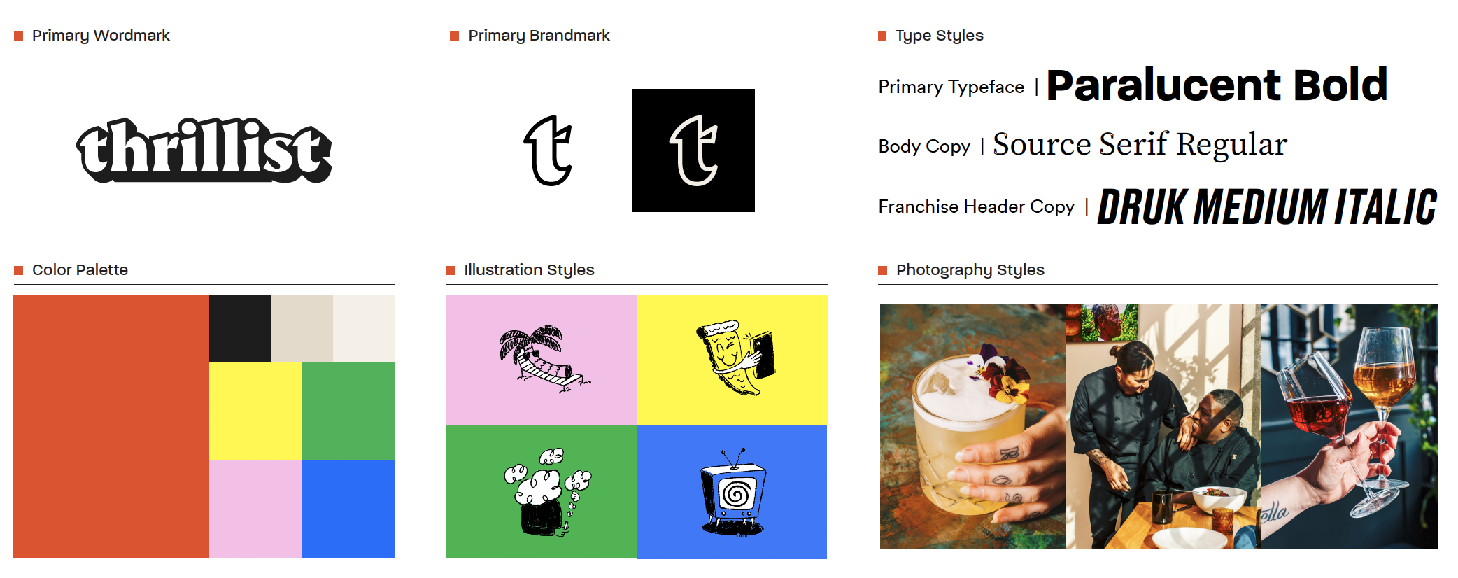
The rebrand, which launched in April of that year, served not only as a new look for us, but a renewed commitment to our role supporting the restaurant and travel industries. Our editorial pipeline also introduced a host of new editors and writers telling meaningful and diverse stories. Everything about our new design was inspired by our core values: taking fun seriously, obsession with quality, always trying new things, and giving our audience a seat at the table.
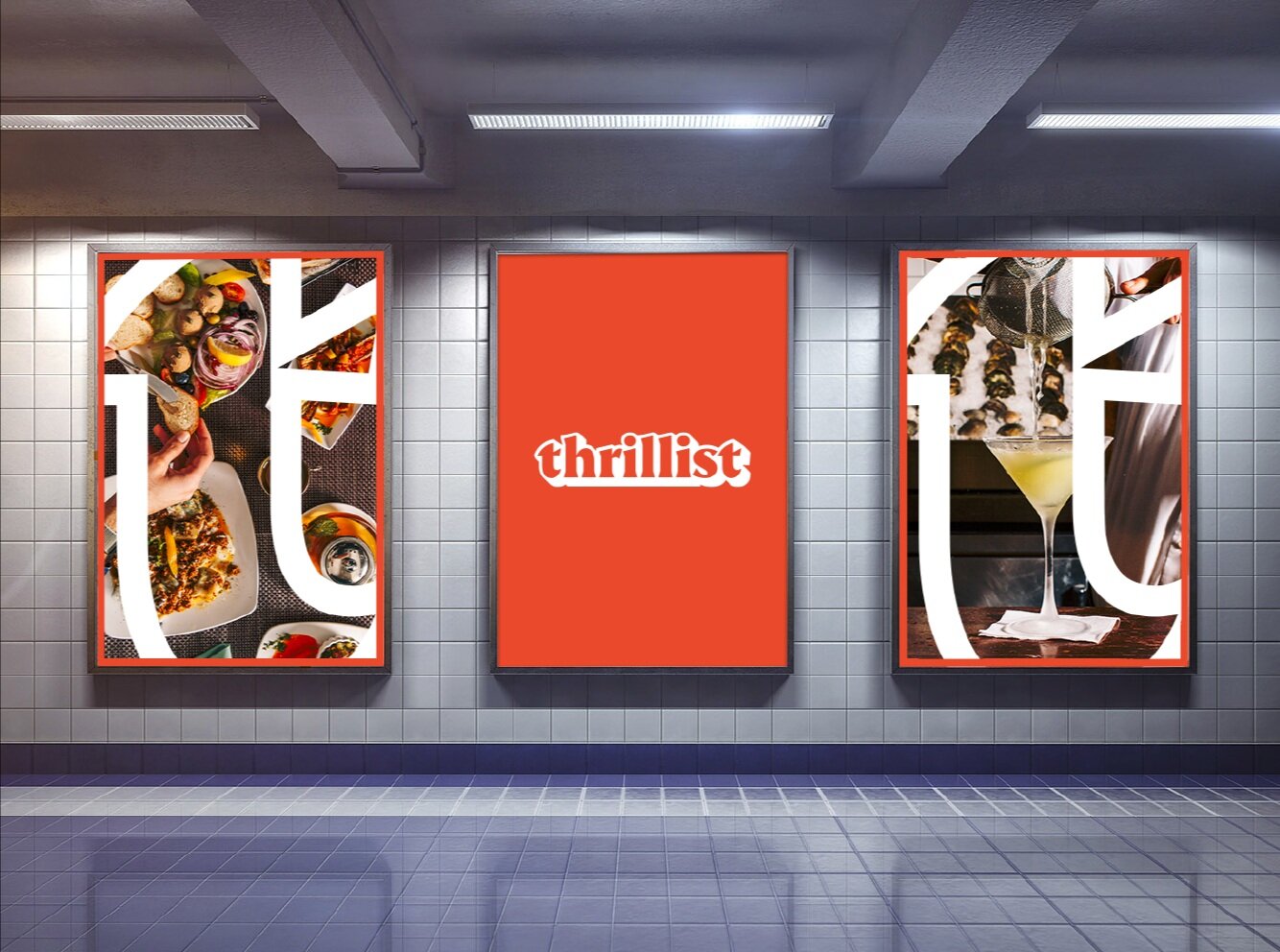
The design overhaul included a new logo, moving from an aggressive all caps type to a fun and playful lowercase one with some dimension and interesting cuts. We also created an icon to complement the wordmark. We moved from a true red into a more relaxed retro orange red, and added a host of secondary colors to help break us out of a crowded color space and give flexibility. We revamped our photography style to give a first person perspective that is immersive, candid, and saturated (full case study on that here). We created new motion graphics and bugs, and revamped the site experience with more sophisticated fonts and a relaxed off-white background.
Once our new identity was in motion, we overhauled and enhanced the site experience to create a distinct, playful and stylish home for readers to discover our content.
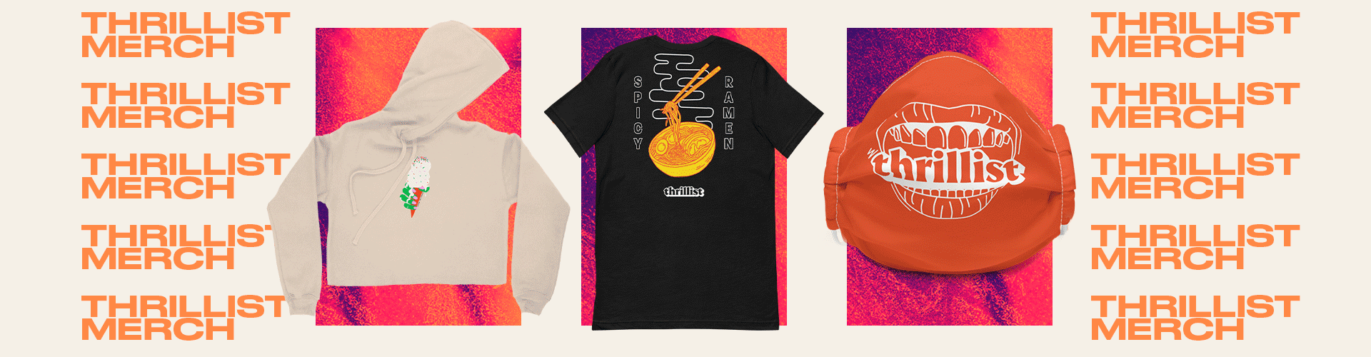
We loved the new look so much, it led to production of some comfy merch, ideal for chilling out with a pizza and a glass of pet nat.